 [German]Quite an unpleasant surprise that Microsoft has flushed onto the systems of its users of Windows 11 22H2 (and probably soon Windows 11 23H2) with the preview update KB5030310. Those using a plain desktop will now be forcibly greeted with a shadow font under the desktop icon texts. It's well known that "Microsoft knows what's good for its user base", but the result just looks like shit and here on the blog two reader comments have already hit complaining about this "innovation of Microsoft".
What is drop shadow in text?
A Windows designer came up with the glorious idea over a decade ago that it would probably look cool if icon texts on the desktop had a shaded font (drop shadow). As soon as a plain colored desktop background is available, Windows adjusts the font of icon titles so that a white font is surrounded by a light gray shadow running into black. The Windows 7 recycle bin icon visible in the following image on the left shows the corresponding representation.
However, these shaded titles are poorly readable for my taste, but not a new invention of the Windows 11 developers. I already had to struggle with this issue in Windows 7 times and published the German blog post Schattenschrift für Desktopsymbole deaktivieren in July 2010. The blog post contains hints how to turn off this shadowing and I had provided a small VBScript script program ShadowOff.vbs which turns off the shadow effect in font rendering via a registry entry.
I even used the script again this year to turn off the shadow font on my Windows 10 1909 Enterprise IoT LTSC desktop icons. I can't believe how long this little stopgap lasted and I also know that the script was used by Windows 11 users.
Shadowed font rendering can't be deactivated
As of September 26, 2023, Microsoft has released preview update KB5030310 with a long list of changes for Windows 11 22H2 (see my blog post Windows 11 22H2: Preview Update KB5030310 (September 26, 2023)). This update will be distributed to all Windows 11 22H2 systems in October 2023 as a security patch and should also bring Windows Copilot to the systems in Windows 11 22H2.
At the same time, the program code for the feature upgrade to Windows 11 23H2 is also on board, if the release of the information is to take place only in Q4 2023. But as I already detailed in the blog post Windows 11 23H2: Rollout chaos; no copilot in Europe thanks to DMA, chaos during rollout is to be expected. And the Copilot will fortunately not be activated in the European region for the time being due to the Digital Markets Act (DMA).

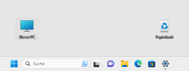
For Windows 11 users who prefer legible icon labels on desktop icons, the preview update KB5030310 has thrown a wrench in the works. After successfully installing the preview update KB5030310, the desktop icons appear with shadow font. For the screenshot above I started a virtual machine with Windows 11 22H2 and installed the preview update. The picture shows this shadow font in the icon title of two desktop icons under Windows 11 22H2 with installed preview update KB5030310.
ShadowOff no longer works
Other users probably felt the same way and were looking for a mechanism to disable this shadow font. If you search the Internet, you might come across my old blog post Schattenschrift für Desktopsymbole deaktivieren. And that's where this comment, where German guy Werner complains that ShadowOff.vbs no longer runs under Windows 11 after patch KB5030310 and asks if there is a solution to get rid of the darn shadow font again?
I have tested it now, the script still runs and can even log off the user. But the registry interventions that the script makes have no effect under Windows 11 22H2 with installed preview update KB5030310. Also my search for options to disable the shadow font was unsuccessful – nothing happens with the corresponding steps.
Second user complaint
Also on my German blog post Windows 11 22H2: Preview Update KB5030310 (26. September 2023 got a comment from German reader Hubert, who wrote that after installing the update KB5030310 shadow font is shown again under the desktop icons. He notes that this is horrible and disturbs immensely when working. After uninstalling the update the font is again without shadow, he found out and writes that the known settings in the registry (ListViewShadow, which are also used by my script above) were all correctly set to 0.
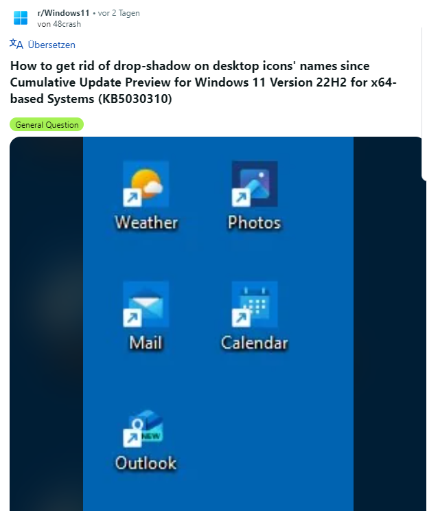
He did some more research and came across the reddit.com post How to get rid of drop-shadow on desktop icons' names since Cumulative Update Preview for Windows 11 Version 22H2 for x64-based Systems (KB5030310) , where someone also complains about the drop shadows as a result of the update. There is no solution – at least nobody has posted anything there either.
The question posted by Hubert in his comment: "At which point would you have to feed this problem to get it on Microsoft's ToDo list?" can also be answered. Tip it all into the beloved Microsoft Feedback Hub – while that's of no use because "don't read, laugh, punch and file" applies there, and the occupational therapy for Windows 11 users has worked.
Because you should never forget: Microsoft knows what's good for you users – Microsoft upper management has publicly emphasized that on several occasions in a highly official manner. So don't complain, but bite the bullet and either look at Windows 10 IoT Enterprise LTSC or Linux.
PS: I've forwarded this article via Twitter to @microsofthelps and asked to forward it to the Windows 11 product group. As expected they told me to post it on the Feedback Hub (but I don't install that thing and post it there ).
I then posted the link to my articles here on Microsoft Answers in this thread – and since I still have a community moderator role, escalated the thread to the Microsoft moderators and asked them to forward this topic to the product group for enlightenment. That's all I can do.
Digging a bit around …
Addendum: First I tried to use an image as background, but my hope that drop shadow will be hidden, was wrong. Using a black desktop background also hides the drop shadow in icon font, but I don't like this dark scheme.
A German blog reader then noticed me, that he found a workaround: Scale the caption smaller until you can still read it well, but the shadow is no longer distracting. That's not an option for many people (I personally don't use Windows 11 and just have a virtual machine for tests).
Another German blog reader then noticed me, that he used a contrast design, which offers a black desktop with white text labeling (without shadow). The he tried a personalization with his custom design with freely selected image and got icon caption without shadows.
Another user told me, that he activated the contrast design "Desert" (Wüste in German) and the shadows disappeared. That brought me to the point, where I begun to poke a bit around. I've documented my experiments here (in German), also with additional registry settings "DropShadow" and "ListViewShadow", that seems to have no effect. Here is a short resume, what seems to work.
Comparing the registry entries of HKCU before and after using a high contrast design brought me to the conclusion, that the registry key:
HKEY_CURRENT_USER\Control Panel\Accessibility\HighContrast
is getting altered. Without a high contrast design, we have the settings below:
[HKEY_CURRENT_USER\Control Panel\Accessibility\HighContrast]
"Flags"="126"
"High Contrast Scheme"=""
"Previous High Contrast Scheme MUI Value"=""
If I switched to the high contrast scheme, the value "Flags" was set to 127. So I switched back to a custom design with a white desktop background, set the above registry entry "Flags" to 127. Then I logged off and on again, and the drop shadow was gone. But it's not optimal, a selected caption text is shown in white and a grey background. That's the point where I stopped my experiments (because I don't use Windows 11 at all). Maybe someone else can pick up the findings for further experiment.
Addendum: Preview Update KB5031455 shall fix this issue (see Windows 11 22H2: Preview Update KB5031455 (October 26, 2023)=.


I can uninstall the update and did just that but after a few hours I was alerted I needed to restart. Baffled as the update was not manually selected by me to download and install from the WINDOWS UPDATE screen, only said Update required – I DIDN'T SELECT IT, it automatically updates in the background without me knowing. I even tried to roll back – System Restore – to last week but again the update will run after a few hours and I'll get a popup to restart. My solution until a MS resolve is found is to uninstall it AGAIN and PAUSE updates!
Did you tried hideshowupdates?
No. Just paused updates. I unpaused to test to see what happens. As soon as I unpause it it starts to install without me selecing anything like all the other updates. The Install button is greyed out. Oh well, guess I will just prevent the install or deal with the dropshadows.
Is there a way to make the text shadow a different (background) color or even transparent? If Microsoft wants us to have it, doesn't mean we have to see it.
Didn't find a way yet – but I didn't dig to deep till now.
Surely this change contravenes Microsoft's 'inclusivity' accessibility policy?
I have experimented with changing the background colour. It has to be dark enough to hide the shadow, but not straight black. My favorite results, so far, are, in RGB, 14, 33, 77 or 15, 17, 77. Not perfect, but something I can live with.
Sono assolutamente d'accordo che le ombre sotto le icone ed i caratteri risultano una cosa abominevole per chi usa il PC, Micorsoft avete via via peggiorato Windows……! Windows 7 TOP
Copio incollo il mio commento su altro blog…
"BRAVO!!!! Esattamente quello che ho pensato io! Da "non esperta" ho perso tre ore a cercare di risolvere questo e altre piccole "iniziative" (ma come si permettono?) dell'aggiornamento. Allucinante. Tra le altre orrendezze lo spazio tra gli elementi di Esplora file, nella colonna a sx…. se provi a mettere "visualizzazione compatta" allora il problema si trasferisce negli elementi a dx e viceversa, un incubo, scusate la terminologia forse poco appropriata ma credo si capisca (loro invece stento davvero a capirli..)"
Bravi, bravi questi "sviluppatori", ma per favore…..
English translation: I copy and paste my comment on another blog….
"BRAVO!!!! Exactly what I thought! As a "non-expert" I wasted three hours trying to solve this and other little "initiatives" (but how dare they?) of the update. Hallucinating. Among other horrendousnesses the space between the elements in File Explorer, in the column on the sx…. if you try to put "compact view" then the problem moves to the elements on the right and vice versa, a nightmare, sorry for the perhaps inappropriate terminology but I think you understand (they really struggle to understand them instead..)"
Bravo, bravo to these "developers," but please…..
Hallo, das ist wieder mal typisch Microsoft. Seit Windows XP habe ich die Iconschrift
mit "Iconoid" in gelb. Jetzt vorbei! Habe die Updates gesperrt und hoffe daß es mit
dem evtl. morgigen Update wieder geht? Wenn irgend etwas bekannt ist, bitte
kurze Nachricht oder installiere wieder Windows 10 und warte auf Windows 12.
Danke
Please comment here in English – or left your German comment within the German blog – both articles are cross linked – thanks.
I've reported the issue to Microsoft. If they change something, I will address it.
thanks for publishing this, as i had the exact same problem with KB5030310 and subsequent updates… after doing all things suggested online, to no avail, here is what fixed it for me:
i have a white solid background, black desktop font, win-11, multiple displays
i am not a techie, so my only explanation is that what i did caused "?" (registry?) to be over-written cleanly
—————
1. access performance "visual options"
start, sysdm.cpl, advanced, performance
-or-
start button, search "performance", select "adjust appearance and performance of windows", opens visual options
-or-
get 'there' via desktop shortcut with target: C:\Windows\System32\SystemPropertiesPerformance.exe
2. then…
make certain "use drop shadows" unchecked…
turn-on/apply "for performance" (should get rid of shadow immediately or after reboot)
for my personal taste: re-activate/apply "show translucent" + "show windows contents" + "smooth edges"
—————
note that this may also have corrected an extreme typing lag that occurred with MSoutlook and less-extreme with MSword, but uncertain if my fix was what also fixed this separate issue
If you install the preview update from October 2023 – the issue has been resolved.