 [German]With the update to WordPress 6.4 on November 7, 2023, the display of (some) responsive themes on mobile devices was broken. This also affected my blogs. In my estimation, a bug fix will only come with WordPress 6.4.3. However, there is now a quick fix in the form of a plugin, which I have included in the blog. I'll quickly document the problem and the fix below – perhaps it will help others.
The problem with WordPress 6.4
The WordPress developers released version 6.4 of the CMS in question on Nov. 7, 2023. It is a major version with various new features (see WordPress 6.4). The installation worked well on my blogs and I didn't notice any ad hoc problems. But it did break the mobile device display of my blogs.
Brief background information
My blogs use a browser switcher to switch between desktop and mobile device display. Two different templates are used for this. This display is switched with the Multi Device Switcher plugin, which has worked great so far.
The reason: I couldn't find a template with a responsive design that generated a suitable – and above all readable – display for both desktop and mobile devices. With the browser switcher, I was able to optimally serve both pages – and users can optionally switch to the desktop view at the bottom of the page on mobile devices.
Mobile device display problem
With the update to WordPress 6.4, however, this construct has gone down the drain, because responsive themes no longer work on mobile devices. Blog readers pointed out to me shortly after the update to WordPress 6.4 that the mobile device display was broken.

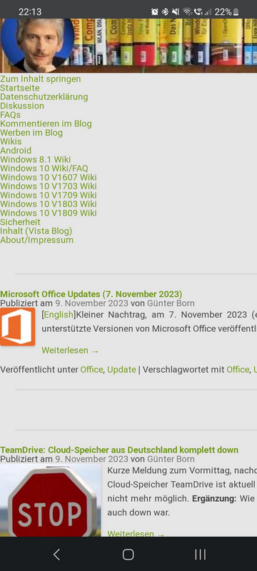
The screenshot above shows the problem: I use a responsive theme RGC Forest for mobile devices (I experimented for a long time until I found the theme that represents the best compromise from my point of view). However, the theme no longer works (like all other themes, TwentyTwo, TwentyFour, I've quickly tested) for mobile devices. The menus at the top of the page do not belong there. The display is also broken in other ways. Correctly it should look as shown below.

This is the display that should now work again in the blog after I have implemented a QuickFix.
What to do, when will there be a fix?
I had already explained the above situation in the German blog post WordPress 6.4 veröffentlicht and also explained why I don't want to perform a quick rollback to WordPress 6.3 (after all, there are six blogs that I would have to restore from my backup in a hurry). I had hoped for a quick fix, but it didn't come. The developers are planning a bug fix version 6.4.2 (see).
A discussion of the whole problem can be found in this bug tracker entry. At this point, my thanks to the anonymous blog reader for this comment, who pointed out the issue and the quick-fix solution. I don't have time for such research – either blogging or getting lost in WordPress bugs – but I can't do both at the same time.
Quick fix with WP 6.4 Theme path fixer
Joe McGill has quickly developed the "WP 6.4 Theme path fixer", which reverts the changes in WordPress 6.4 that cause these problems with responsive designs in the templates. The fix is available on GitHub as a file plugin.php. Here are the steps to get the fix up and running.
- Go to GitHub and the Download ZIP button in the top right-hand corner to download the ZIP archive with the plugin locally.
- Unzip the ZIP archive file with the crazy long and cryptic name into a local folder. You should find the plugin.php file in one of the subfolders.
- Then add this plugin file to the WordPress plugin directory according to my description below.
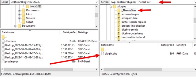
The first step is to upload the plugin to the WordPress instance. I did this quickly with FileZilla. To do this, navigate to the /wp-content/plugins folder on the WordPress installation and create a new subfolder for the plugin there. I have named this subfolder _ThemeFixer so that I can quickly find it again later.
 Then upload the plugin.php file to the new subdirectory (the screenshot above shows the relevant locations). In my case, there is still the challenge of finding the correct path, as I have several blogs on one instance and had first uploaded the plugin in the wrong directory – nothing happened during testing.
You can also use the Add new plugin command in the dashboard under Plugins. Then you don't need Filezilla, but can't choose the name of the directory.

If everything has been uploaded correctly, you should be able to find the entry for the WP 6.4 Theme path fixer plugin in the WordPress dashboard under Plugins/Installed plugins. The plugin must be activated there for the whole thing to take effect. Then it's time to test it on mobile devices (don't forget to update the display during the test if, for example, you emulate the mobile device display in the Google Chrome browser via the developer tools). Thanks again to the anonymous reader for this comment, which enabled me to make a quick fix. The display should be readable on affected mobile devices again.
If the bug is later fixed in WordPress, it is sufficient to deactivate the plugin again and then delete the plugin folder with the relevant data. You can use either the Delete hyperlink in the WP plugin entry – or delete it with FileZilla.


